Excel thermometer charts can add visual appeal to an existing dashboard or be used as a standalone graph. The Excel thermometer chart with base is simple with clean lines, and easy to use. Below are seven that we’ve created providing several color options. All charts are fully functional, meaning the thermometer “fills” based on the data input.
Excel Thermometer Chart with Base
System Requirements & Download
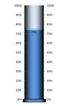
Excel Thermometer Chart with Base – Blue
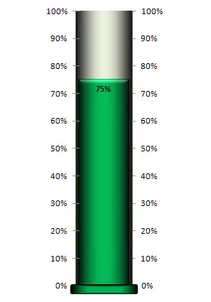
Excel Thermometer Chart with Base – Green
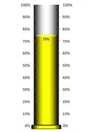
Excel Thermometer Chart with Base – Yellow
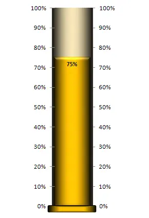
Excel Thermometer Chart with Base – Orange
Excel Thermometer Chart with Base – Red

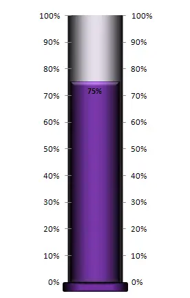
Excel Thermometer Chart with Base – Purple
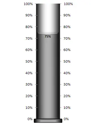
Excel Thermometer Chart with Base – Gray