Business development and sales are two different ideas. However, they both generally lead to a similar outcome – revenue growth. Regardless of which concept you or your business chooses to focus on, results must be tracked and evaluated. This template can help. It’s a Business Development KPI Dashboard. It’s free and built with Excel, so startup time is short.
Business Development Dashboard
System Requirements & General
Business Development KPI Download
Download 42.89 KB 9613 downloads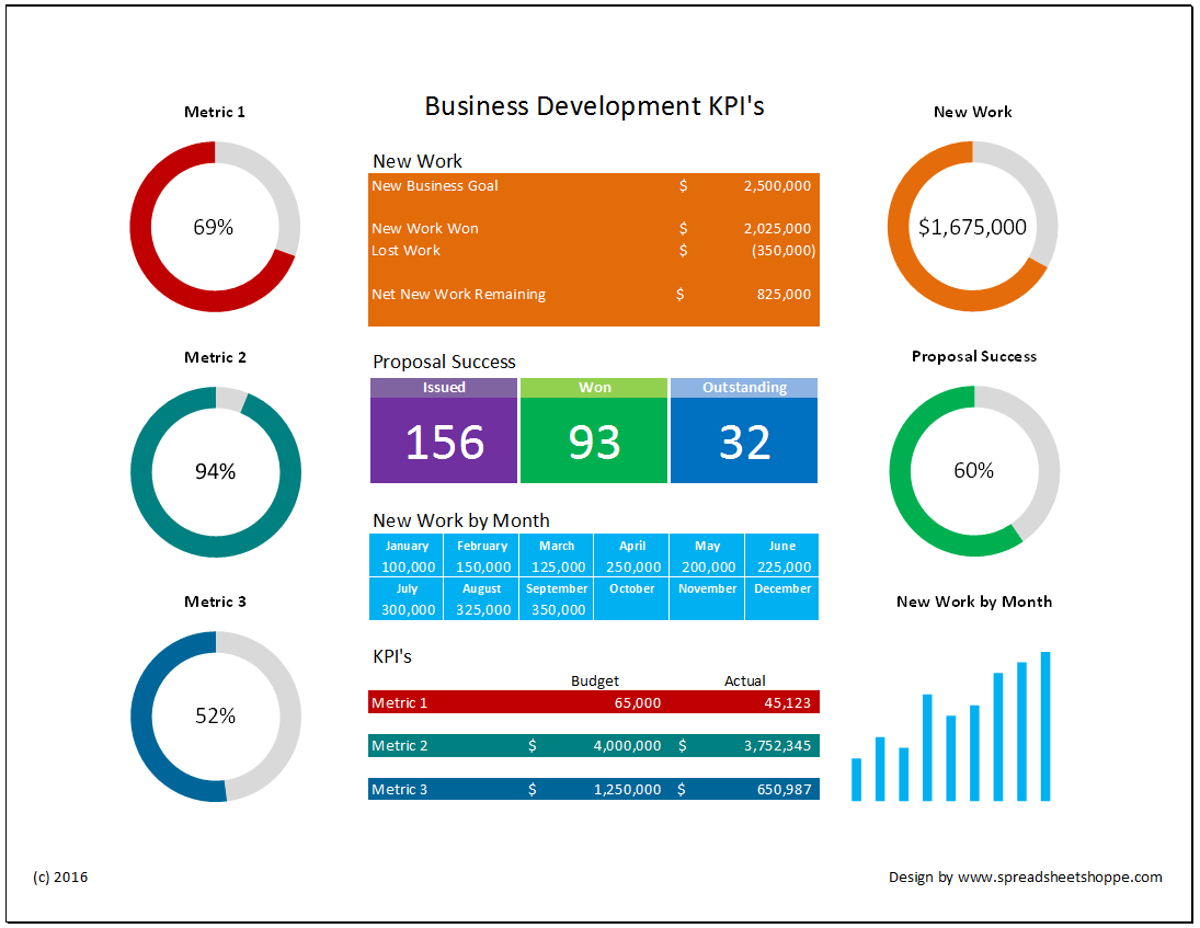
How to use this dashboard
One of the problems with some dashboards is they become overly complex. Too many charts and graphs. It takes time to get up to speed. This dashboard attempts to address this issue by simplifying.
- There are only 6 charts.
- The data driving these charts is part of the dashboard.
- Chart titles are linked to the titles over the data.
- Data and charts are also colored to match each other.
Understanding Layout
For each grouping of data in the center of the dashboard, there is a corresponding chart. The chart will have the same title as the data. The chart will also be colored to match the data.
New Work – The top orange section corresponds to the top right chart. This chart shows the new work won less the lost work. It’s your net wins. Generally, businesses have a new business goal for the year. Starting with this goal, work is won and lost. Your new business goal plus work won less work lost tells you how much new work needs to be won. This data is tracked in the orange section of the Dashboard.
Proposal Success – The second set of data points captures key information on the proposal process. There are 3 data boxes. The purple captures Proposals Issued. The green captures Proposals Won. The blue captures Proposals Outstanding. The middle chart on the right corresponds to this data. It’s the Proposal Success percentage. It’s green because it’s matched to the Proposal Wins. It shows what percentage of your proposals have been won, excluding the ones still outstanding.
For example, lets say you’ve issued 110 proposals, but 10 are still outstanding. This means you know the results on 100. If 75 of these have been successful, your success percentage is 75% (75/(110-10)).
New Work by Month – This is the light blue section of the data. It corresponds to the lower right light blue bar chart. Each month, you enter the amount of new work that was won that month. The total here drives both the bar chart as well as the new work section of the orange data. You only have to enter this data once!
Metric 1, 2 and 3 – The last three metrics are open to track business development KPI’s of your choosing. They’re setup to compare a budgeted/expected number to actual. When you rename Metric 1, 2 or 3 in the data table, the chart names will automatically update to match. Also, the coloring of these metrics correspond to the charts as well. The charts show the percentage of actual to budget. When your actual exceeds the budget, the percentage will be greater than 100% and the chart will be all one color.